By now you have your own pixel font (if not, read part one first). What you're lacking is any real characters. There are a few pitfalls when creating anything more complex than a single rectangle.
Intersecting Contours
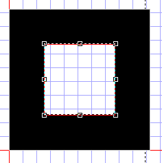
Imagine we were creating a capital 'L' character. we want a vertical beam and a horizontal beam. We could do it like this:
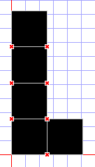
But those read crosses mean something is wrong. In truetype, contours are not allow to intersect (overlap). What we need to do is create a single contour with more points. In point editing mode, right click on a point and choose "Add Point". A new point is added on the contour between the selected point and the one before it. You can drag this new point to change the shape. Always use the "Transform" popup window to enter positions, since you want them to be perfect multiples of 256. You should end up with a glyph like this:
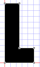
This glyph is nice and valid, and will work in Flash (Flash can be quite picky about intersecting contours and render the font vert strangely).
Hollow Glyphs
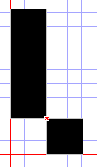
When we want to create a glyph with a "hole in the middle", like an 'o', we have to use contour directions. Consider making an 'o' using the above technique. We're fine until we need to "join it up":
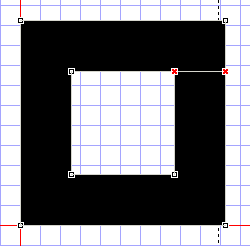
To avoid intersecting contours, what we have to do is create a single solid contour of the outside edges of the shape, then add another contour on top of it, with it's "direction" set backwards, to represent the "hole".
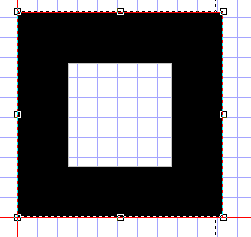
To change the direction of a contour, right click on it in contour edit mode, and choose "Change Direction".
Intersecting Corners
The last major problem you'll encounter is doing cornered pixel joints. Imagine the following:
You can't easily make this into a single glyph, so what can you do. The solution is fairly hackish, but a necessity. What we actually do is adjust the sizes by a few FUnits (eg. 1) so that they are a single glyph. For example:
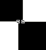
(This is a VERY zoomed in view)
By changing two of the points to 255 instead of 256 (we change two because we want the line to be straight) we actually create a single solid glyph that appears to have an intersecting corner, but which is valid and renders correctly.
Cleaning Up
So your font is created, you have naming and copyright info in there and you've set the version number (both on "Naming" and "Settings"). What's left to do? Run the validation wizard! Choose "Font -> Validate..." from the menu.
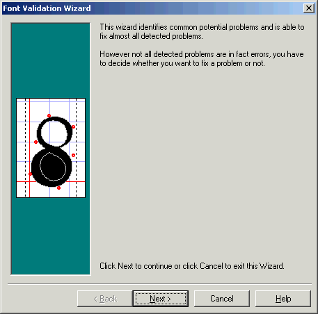
This wizard can find and fix a bunch of problems that you may have. Most importantly, it fixes contours with incorrect direction and points out intersecting coordinates. Once your font passes all the validation tests, it's ready for release! Though it might be worth testing it in Word and Flash first ;)
Postscript
This tutorial was created by Cal Henderson. He makes fonts which you can find here.
15 people have commented


I need to create a font for writing very tall bar-codes in windows. (Like 5500-6000 high in the metrics tab.) I couldn't find any existing. Is this possible to do?
Different renders stop working at different huge metrics, so you'd want to test on native windows apps, native mac apps and flash at the least.

We have 2 to be constructed from scan. They will have to be redrawn from the scan. Do we have them redrawn?
Please let me know
Thanks
Sandra / papergrafix toronto


Great article. I found it really useful when I was converting an old Amiga bitmap font to TTF. There is, however, a small error in your tutorial. In the beggining you write:
"A bit of trial and error reveals that if you use point size 8 at 96 dpi it's the same as point size 6 at 72 dpi (96*6 = 72*8)."
While the formula is correct, the explanation is not. It should read as follows:
"A bit of trial and error reveals that if you use point size 6 at 96 dpi it's the same as point size 8 at 72 dpi (96*6 = 72*8)."
Small thing, but it may confuse people :)
My resulting work: <a href="http://ptless.org/sfomi.html">ptless.org/sfomi.html</a>


thanks for the article,how many pixels can fit into an A4 paper?
Leave your own comment
Comments have been disabled
# October 25, 2009 - 10:42 pm PST