Mark Newman at the University of Michigan has put together some nice visualizations of voting patterns in the 2012 US presidential elections, scaled by number of electoral college votes, rather than by land area.
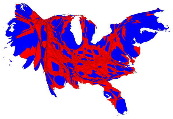
Mark Newman at the University of Michigan has put together some nice visualizations of voting patterns in the 2012 US presidential elections, scaled by number of electoral college votes, rather than by land area.
chartwell is fucking awesome. using ligatures for SCIENCE
oooh, good's best infographics of 2009
this interactive neighborhood map of nyc is very very well done
some excellent data visualization on the afgan war
wow, this analysis of choose your own adventure books is really really excellent. genius
this infographic-style resume is wonderful. hire this human
this nyc subway ridership map is very very nice. great presentation
while the last line sounds anti-css (sort of?), it turns out pie charts suck
this is my favorite new flickr page. lots of gems in there
This is the personal website of Cal Henderson, Slack co-founder & CTO.
I give occasional talks, write code and sometimes articles.
aws books color covid emoji fonts games halflife havana ibm lego maps math minecraft music php programming reading technology tube via-matts via-momorgan wiring wow
apple awesome bacon code coding comics design flickr food games javascript lego maps movie music perl php programming software tech tv video visualization web