Posts tagged visualization
Andrew Godwin has just released an excellent mapping project, visualizing a few London Underground stations, complete with public corridors, escalators, spiral staircases and platforms. The maps are 3D models, which you can pan and zoom inside the browser. Digging into the source is also worth a look, since it uses some nice canvas and three.js guts.
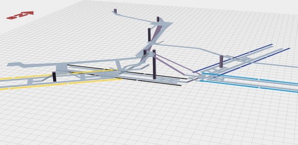
Poking around his other work, the Twin Tubes map is also worth a look - the underground network with each individual track visualized.
the process behind stamen's beautiful watercolor map tiles
cube looks like a nice little system for graphing. reinventing a fun wheel
lovely npr infographic of the nasa space shuttles
chartwell is fucking awesome. using ligatures for SCIENCE
very awesome visualization of movie revenues week by week over 2010
yup, the universe it pretty big. and the planck length is pretty small
an excellent visualization interface for samples used in the new girltalk album
canvasmol visualizes molecules using canvas. the future is sexy. and rotating in 3d
wow, flyfire is amazing, i see many small robots in our future
oooh, good's best infographics of 2009
this interactive neighborhood map of nyc is very very well done
some excellent data visualization on the afgan war
wow, this analysis of choose your own adventure books is really really excellent. genius
this cell sizing demo is very nicely put together. i'd like a version that goes up to galaxies and down to atomic nuclei
i've linked it before, but daytum is pretty awesome
the folks at youcity are basically insane geniuses. with a focus on the insane part
this infographic-style resume is wonderful. hire this human
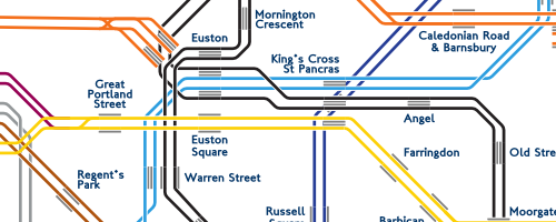
this nyc subway ridership map is very very nice. great presentation
S&W's horizonless maps of new york are lovely
while the last line sounds anti-css (sort of?), it turns out pie charts suck
detecting the click track through science. nice
my song colors are a bit busted. wonder if there's an XSS bug if you listen to certain music...
these election map visualizations are very nicely done. do you think the color-by-population was done by hand or with some fancy software?
this coffee tasting flavor wheel is a really beautiful visualization
this is my favorite new flickr page. lots of gems in there
skyrails sure looks pretty, but does it actually help with visualization? i'd love some good examples of where it adds value
i was told about this a while ago but only just found it - an awesome infographic showing the samples used in a single track from the latest girl talk album
over-enthusiastic anatomy diagrams are freaky. nice
this diagram comparing giant planes makes me inexplicably happy.
a useful flow chart for reference. thanks mr hammond
mr carden pointed me to word tree for creating interesting visualizations. still not quite what i'm looking for here
the simply hired job graphs are pretty awesome
beautiful visualization of box-office revenues over time. in the style of those last.fm wave graphs from a while ago [via hammond]
last graph is inspired by lee byron's lovely wavegraph
beautiful cupcake flavor availability visualiztion [via asc]
i thought i'd linked to cabspotting a while ago - maybe not.
stamen's backchannel visualization is beautiful. reminiscent of my irc log cloud perl software which i appear to have lost.
omg. this is the best map visualization of public transport in the us i've ever seen. beautiful. via the cameron factor
aaron found this [lovely piece of visualisation](http://loop.aiga.org/resources/loop/loop9/colorproject/gallery.html) - "33,000 words, grouped by meaning. Each word is given the average color of
web images found when searching for that term."