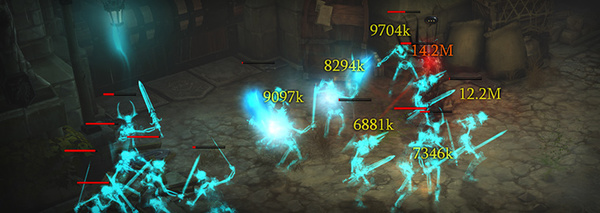
Internationalization, math and the way numbers make users feel. The design of Diablo 3 numbers is a really nice look at how these all interact.
iamcal.com Since May 2000
Posts tagged design
Diablo 3 numbers
Legal and Illegal Builds
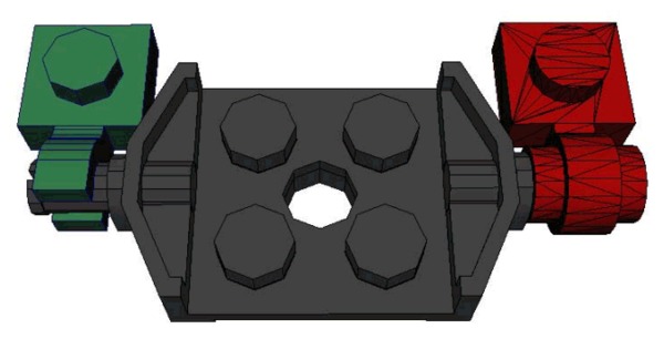
Jamie Beard's talk on Stressing The Elements looks in detail at how Lego bricks are meant (and not meant) to fit together.
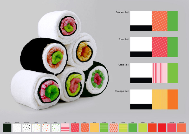
Sushi Towels
Why are these Sushi Towels not actually available for purchase?
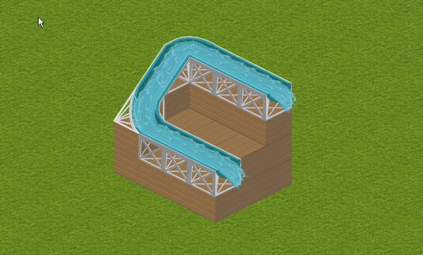
Buildy
Buildy seems like it might be fun, in a modern City Creator sort of way, but I haven't managed to create anything cool myself (here's my effort) and there's no good directory of player-created stuff. Have any of you been playing with it?
Map Radio
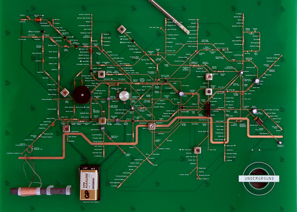
I was sure I had posted this earlier, but the Yuri Suzuki Tube Map radio is excellent.
Particularly like some of the modified station names; Oxford Circuit, Earl's Coil, Clapham Jumper, etc.
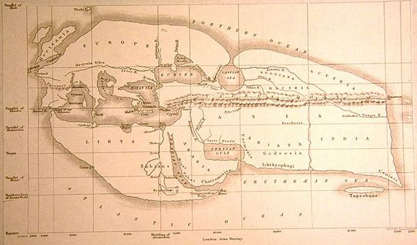
Early world maps
A fascinating look at early maps of the world. The relative scales vary wildly.
23rd January, 7:58 pm
want. a thing of such beauty
28th October, 5:26 pm
shape type is really nicely done - that shit is hard
26th June, 5:48 am
interested in transit mapping? then settle in and read this excellent paper
23rd June, 1:04 am
ooh, the why yachts are now really for sale. i'll take a dozen
20th June, 5:41 pm
lego sculpture is like manual minecraft
10th April, 8:55 pm
i really want this awesome cocktails poster. yes pls
27th March, 7:58 pm
wooden toy container ships? want
25th March, 8:25 pm
you should turn on javascript. the reasons for having it disabled are pretty accurate
23rd March, 3:40 am
chartwell is fucking awesome. using ligatures for SCIENCE
28th February, 5:46 pm
the lego letterpress is a great idea - easy re-configuration and registration
12th January, 9:19 pm
it's true - sci-fi corridors are fascinating
13th September, 6:18 am
oooh, i really like these lost tarot cards [via tom]
16th June, 6:58 pm
this is great. be sure to click the link in the bottom right
13th June, 5:18 am
awesome video on the making of the w+k nike fish-shoe. some really nicer work coming from them lately
26th January, 12:17 am
damn, this is sold out. sucks to be me. love the e-t forms
7th January, 7:24 pm
oooh, good's best infographics of 2009
27th December, 11:47 pm
an excellent interview/article with jeff kaplan from the wow team on game design stuff
14th December, 3:26 am
the "i can read movies" series of book covers is incredibly well done
14th December, 3:19 am
these torn lights looks very very cool. would probably make for some pretty odd light distribution though
24th November, 3:48 am
some excellent data visualization on the afgan war
22nd November, 2:31 am
there's not really any excuse for not contributing to nickd's book project on kickstarter
20th October, 5:34 am
i really want this LED coffee table. pricey, but maybe worth it
16th October, 5:42 pm
linos is a beautiful little portable record player
13th October, 10:27 pm
are these fans real? hair doesn;t seem to be moving in the demo video
21st September, 5:15 pm
PIG 05049 tracks all the products made from a single pig
18th September, 8:45 am
chopping board + scales + e-ink = 1-3 years away? nice concept
4th September, 5:30 pm
awesome experimental penguin book covers from 1948
25th August, 5:06 pm
24th August, 3:45 am
beautiful cellphone concept for displaying weather. lovely
14th August, 5:06 pm
these LED stair rails are great, but the designer's site is a flash monstrosity that wont let me view his portfolio. why do people think that's clever?
28th July, 10:28 pm
awesome pizza box concept that turns into plates and a small left-overs box. hot
27th July, 8:58 pm
this interactive music video is wonderful. takes a while to load, and isn't obvious what's going on (percentage at the center bottom on light type)
2nd July, 5:51 pm
this infographic-style resume is wonderful. hire this human
29th June, 1:25 am
this excellent concept for folding UK 3-pin-plugs is so genius that i'm surprised it hasn't been done before. i want one
1st June, 2:20 am
so this is pretty awesome - an agency website done entierely in linked youtube videos. very very nice
12th May, 1:50 am
these maps are super beautiful. are they just on show at the moment, or can you buy them?
9th May, 7:03 pm
these beautiful bento boxes are lovely. why isn;t my lunch this pretty?
7th May, 2:22 am
i want to take part in this creativity test
5th May, 4:31 am
comcast town seems like a snazzy update to citycreator, but is kinda sucks. lost all me designs with an exploratory click. menus are too deep and hidden (i want to see everything!) and the tooltips are dog slow. bah. do it right please!
4th May, 9:47 pm
S&W's horizonless maps of new york are lovely
16th April, 6:34 am
a beautiful photo over on kottke. but when did he redesign? best design since the orange juice
14th April, 5:00 am
happy chairs are happy. chairs.
14th April, 1:23 am
some wonderfully creative my little pony sculptures. love em
11th April, 3:37 pm
while the last line sounds anti-css (sort of?), it turns out pie charts suck
24th March, 10:52 pm
noah stokes' new "portfolio" is excellent. i'd hire him
22nd March, 4:29 am
book spines as pixel art? kinda cool. but my books are all different sizes
21st March, 7:05 am
aviary is very very well done. the demo videos are pretty well put together. barrier to doing something slick on the web has gone up a lot lately.
21st March, 7:02 am
not sure why i have fluid design in my 'to read' folder. i mean, it's pretty stuff. maybe i know someone who works there? maybe you work there? hmmm?
19th March, 6:23 pm
this is what IE6 deprecation pages should look like. well, maybe.
6th January, 9:37 pm
these Luigi Colani designs are awesome. how planes were meant to be
9th October, 4:34 pm
mr hicks is going to do design for opera. should be interesting
9th October, 2:41 am
dead celebrities in type? that's kinda awesome [via lealea]
24th September, 8:33 pm
"No gradients were used in the production of this site."
24th September, 6:37 pm
did i ever link to bomomo? i should have, because it's awesome fun
24th September, 5:45 pm
some beautiful icons to brighten your morning
20th September, 8:09 pm
omg. just been reminded about how fucking awesome the burton/uninc 2008 board range are. i want every one of these. except maybe the monkey. i need the kitten for sure. and the seal. gah!
17th September, 4:14 pm
we need to resurrect the calling card. gentlemen, to your letter presses!
12th September, 12:30 am
oh god, i love this set of designs so hard. i need more beautiful text in my life
10th September, 8:57 pm
atmosphir looks like it might be a lot of fun. can't wait to get in the beta [via schill]
10th September, 12:13 am
i love nut and bee and think i'll get some prints. anyone got any? i wonder what the quality is like
9th September, 12:00 am
this is my favorite new flickr page. lots of gems in there
29th August, 6:45 am
i miss h73. has it really been that long?
6th June, 4:52 pm
a review of atm interaction design from one of the guys that designed the (awesome) wells fargo atm interface
2nd April, 7:12 pm
the new UK coins look beautiful. the moderization of money is an odd process, but pretty awesome
28th February, 5:36 pm
blik are making more awesome wall decals. i'm jusr running out of walls
25th January, 4:19 am
the design police should be a real police force
12th December, 9:41 pm
command-shift-3 is pretty nice. kitten war for web design [via coatse.cx]
19th November, 7:44 pm
did i already link to the web version of elements of typographic style? i should have
7th October, 10:25 pm
i don't know what it's all about, but tom's ffffound page is lovely
27th August, 11:46 pm
the macdonalds nutrition icons doc is great reading [via asc]
21st August, 12:05 am
lost garden is a lovely game design weblog and the challenge tileset is inspiring
27th July, 8:06 pm
some nice shirts from fictional places and companies - i want the weyland-yutani one [via hchamp]
22nd June, 7:26 pm
the new sfo site is really quite beautiful, but it also reminds me of one of the design/type portals from the olden days - anyone remember which?
19th April, 6:05 pm
hardboiled have some nice shirts [via heathr]
17th March, 12:13 am
james? updating? what is the world coming to?
21st December, 3:11 am
salti pointed out this nice article about producing pretty bar graphs with CSS
31st October, 7:38 pm
the peronalized version of the google homepage is really fucking ugly. got redirected there visiting the frontpage this morning. maybe there's some trial going on.
24th October, 11:11 pm
is this thing edible? i'm not sure, but it's beautiful.
17th October, 4:40 pm
edmonton-based web superstar lealea has just launched her new company site. tres awesome
27th September, 3:29 am
brian fling, d. keith robinson, matt may and nick finck have started blue flavor. might be one to watch in the near future.
19th September, 5:56 pm
hurrah for pixel fucking. an adny production i believe
20th April, 5:18 pm
the perfect prescription talks about redesigning the pill bottle - good physical design stuff [via newstoday]
19th April, 4:23 pm
angermann2 is my new favorite weblog. architecture, cartography and bold design.
19th April, 6:09 am
coates has a brand new shiney design. very minimalist
25th February, 7:06 am
i'm sure it's been up for a million years by now, but su's redesign is mighty fine.
11th February, 6:08 am
youyesyou once again has the best valentines cards ever.
1st February, 6:49 pm
the wasp t12 speech tool is "well weapon". denise is awesome.
15th October, 2:33 am
digital thread was the zine i was looking for which made me run into areiform. full of really useful content, including their awesome fonthaus.
15th October, 2:31 am
aeriform are still looking good after all this time.
12th October, 6:38 am
'vancouver' magazine (yeah, snappy title) has photos of the awesome-looking millenium line skytrain stations. the station shown (brentwood) is probably worth checking out in person, and i intend to when i get the time.
7th October, 4:58 am
oooh - a harry beck trading card. that man was a tufte-esque genius.
14th September, 6:24 pm
wigu fan art in the form of a tDR parody. oooh - i wonder if tDR have new shirts out.
About
This is the personal website of Cal Henderson, Slack co-founder & CTO.
I give occasional talks, write code and sometimes articles.
Recent Tags
aws books color covid emoji fonts games halflife havana ibm lego maps math minecraft music php programming reading technology tube via-matts via-momorgan wiring wow
Popular Tags
apple awesome bacon code coding comics design flickr food games javascript lego maps movie music perl php programming software tech tv video visualization web
